Rebranding LOT318
Recently we had the opportunity to rebrand LOT318’s with a new logo and complete brand package. LOT318 stands for “Loving Others in Truth” and is a non-profit organization dedicated to minister at risk youth and their community by empowering and educating them to see their worth and purpose.
When LOT318 came to us, they already knew their branding was out-dated and in need of something fresh and new. They wanted to their new logo to be more professional and “clean,” while retaining the fun and edge their current logo communicated. They were not married to the original color pallette or any design elements of their brand, so we had a lot of creative freedom to experiment!
As an organization who is primarily helping children, we knew we needed to liven things up and get fresh with our color scheme and designs to better tell their story and connect with their audience. So to begin the process of rebranding (and with any of our projects) we began researching! (If you want to know more about our logo design process, please check out this blog post, “How to Create an Awesome Logo.”)
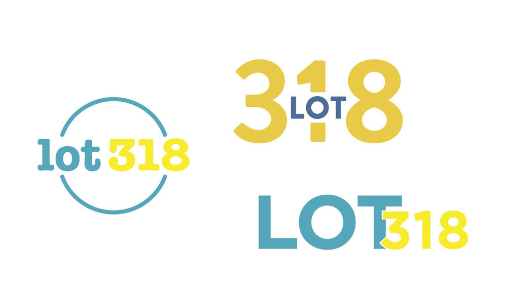
We began by bringing in elements reminiscent of elementary education. We experimented with the idea of incorporating a mark of some sort. While we liked the options we were coming up with, we wanted to explore an option that was less of a departure from the look and feel of the current logo, but with a more refined and intentional look.
After several rounds of options and meetings with the Director of LOT318 while testing the options with LOT318 volunteers and influencers in the non-profit world, we settled on two options and one color scheme: a simple, text-based logo that evoked the elementary education feel; and a logo using a mixture of hand-lettering and a font to create an organic, community-based feel. In the end, the LOT318 Board of Directors voted unanimously for the hand-lettered option.
We kept with a bright color scheme and kept the design fun and playful with a unique, hand-lettered approach. Once we established our hand-lettered “LOT318” we found a font called Blackflower that was similar, to use for their tagline “Loving Others in Truth”, and could also be used for other special needs like newsletter art or social media posts.
COLORS
FONTS
Finally with all of the details determined, we presented LOT318 with a brand package. Basically, we gave them everything they needed to create anything under the LOT318 name. This included their color scheme, their primary and secondary logos, supporting brand elements and their font package to be used in conjunction with their new logo on all marketing materials for both offline and online needs.
A basic brand package is extremely important for any business to succeed. It encompasses all of the tools needed to come across as a uniform and complete brand that can be recognized by an audience and make any business look professional and credible.
Stand out from the crowd and establish your brand! If you want to know more about our process or how we can help your brand, contact us here!


