Veracity Case Study
Deliverables
Meet Wendy Hooper Ross, an Orange County real estate expert with decades of experience. Known as “the professional’s choice,” Wendy primarily works with executives and business owners. In 2019, Wendy decided she wanted a big change: a rebrand that matched her strong and feminine personality, showcased her skills, and built a foundation for her organization’s future that would set her apart from the competition. She didn’t know exactly what that looked like or how to go about the rebranding process, and that’s what brought her to us at Rogue.
A client with a unique voice, an exciting personality and an appreciation for creativity who wants to stand out in an industry where the status quo is embraced? This was essentially our dream scenario!
PHASE 1: STRATEGY
After meeting Wendy, we jumped right into the Strategic Phase of asking a ton of questions and getting to know her as though she were our new best friend. If we’re going to tell a client’s story, we need to be able to confidently represent their specific voice.
As the face of her brand, Wendy needed to feel represented. Wendy has a distinctive personality and approach to real estate that needed to be reflected. Additionally, she needed a brand that would powerfully represent a team of real estate experts down the line.
In a world where most realtors stick to traditional, professional marketing, Wendy wanted to go bolder with new… well, everything! At the end of Phase One, we landed on a strategic plan that included new branding (including a new name for her agency), a brand ID video, website, brand merchandise, social media creation, photography and a launch event. But, the branding had to come first!
Before we could begin designing, we spent some time with Wendy learning about the brands and aesthetics she was drawn to. Wendy loved the classic iconography of Nike, Apple, Chanel and Louis Vouitton. Then, we spent several weeks developing the voice of her brand (bold but playful; professional but irreverent), her brand persona, and how to communicate what she wanted to be to her audience. With that, we set off down the path of brand development!
PHASE TWO: STORY
The first part of establishing her new brand was deciding what to call it. Through internal brainstorm meetings, our team created a list of different words and phrases––from animals to virtues to abstract concepts that matched Wendy’s personality and values. We tried translations in different languages and even tried new word combinations and even just making up words! Ultimately, we needed something strong that represented her straight-forward character. When we found “Veracity,” we all knew it was perfect. Thus… Veracity Real Estate Co. was born!
With the perfect name in place, we moved on to brand design. After playing around with nine black and white logo designs, and a lot of back and forth, we decided upon soft, V-shaped waves and a color palette based on a coastal feel and Wendy’s love of blue. We accented her logo with bold serif fonts, created a statement pattern for her business cards and merchandise and finished up the beautiful Veracity brand standards.
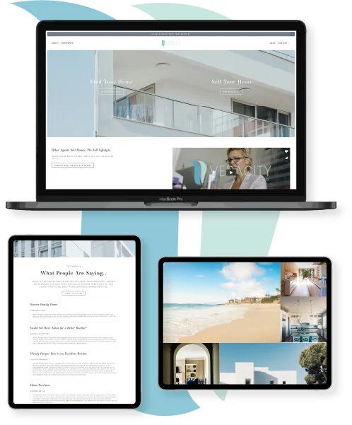
Let’s be honest though, the real fun of branding is getting to apply it, and the Veracity website was our first playground for that. Our website plan centered around two major goals: showcase Wendy’s expertise as a realtor and create a simple user flow for buyers and sellers that would allow fast access to home listings. Then, we brought the new branding into the design for a cohesive site that matched her personality and logo.
While the web and content teams were working on the website, the video team got to work on the Veracity brand ID video. Strategically, this video needed to introduce new clients to Wendy on her website and at promotional events. It combined the same logo, fonts, color palette and overall style we designed along with important client testimonials that send a clear message: Veracity wants to help people find their dream homes and Wendy has the expertise to prove that she can do it.
PHASE THREE: TELLING
With the branding, website, video, photos and design pieces all in place–the ideal brand foundation–it was time to introduce Veracity Real Estate Co. to the world. So, we planned a brand reveal event at the Center Club in Costa Mesa and created social media content, merchandise, stand-up banners and more to make sure everyone in attendance got the full Veracity experience.
Wendy’s clients, friends and fellow realtors all agreed; they hadn’t seen anything like this branding before, and it definitely fit her personality. (Exactly what she, and we, wanted to hear!)
Of course, we love to go above and beyond for our clients and we had one last surprise for Wendy and we presented her with the finishing touch: Veracity’s printed brand standards, beautifully framed for everyone to see.
ROI
So what did we fulfill?
Stand-out branding amidst a more uninspired community of competition
Cohesive branding across all channels
Increased engagement with solid brand identity that matches Wendy’s personality
Brand experiences including a video, photography and an event to bring the Veracity brand to life
Simplified, responsive and search engine optimized website for optimal user experience


