BRASA Rotisserie | Phase 2: Story
Welcome back to BRASA’s three-part marketing story! Have you read part one? If not, go back! If you have, let’s carry on to Phase Two: Story of The Strategic StoryTelling Framework.
If you recall, the Story Phase is where action starts to happen. With the insights we gained from Phase One, Strategy, we started with a plan to focus on their branding while also setting up the BRASA social media accounts on Instagram, Facebook, Yelp and Google. We would need to build their audience on multiple platforms, facilitated with a logo and complete business details. This would help us direct traffic to their website, and ultimately, their restaurant! Finally, we would develop a grand opening strategy, complete with foodie influencers and community awareness.
Logo Designs
As always, we started drafting up logo designs. BRASA wanted to focus on their prized possessions: the BRASA chicken and the charcoal-fired rotisserie oven. We wanted to convey the warm, family-friendly environment of their casual restaurant. The owners also expressed a love for orange and green. We went through many ideas and iterations, as you can see here.
Say hello to the final logo!
As part of the branding process, we created a #eatbrasa, a hashtag that served as a tagline and call to action throughout their branding.
The brand package led to a variety of collateral pieces including t-shirts and hats–designed to be their in-store employee uniforms–stickers, packaging, menus and more!
Website
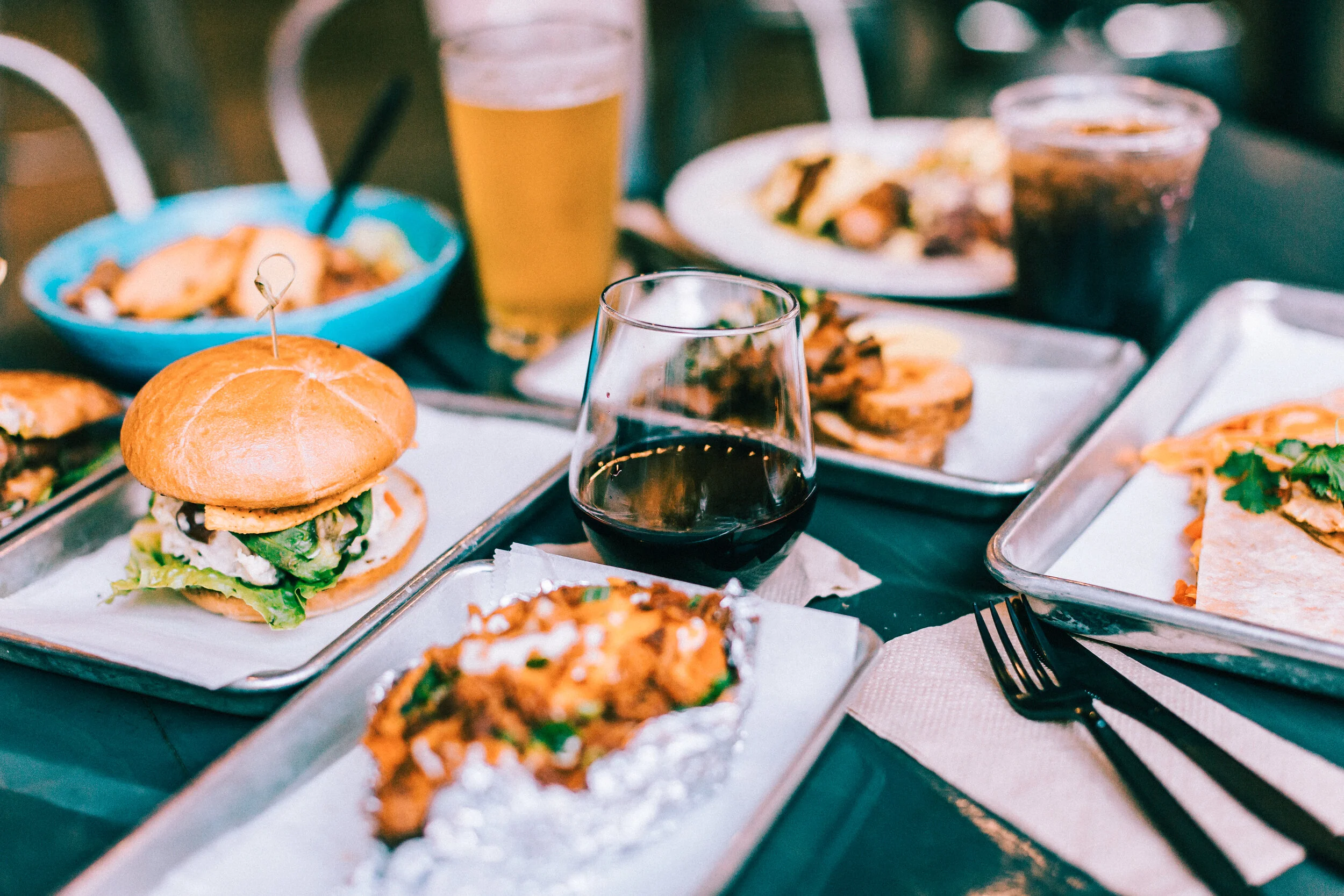
Then, it was time to put their newly designed branding to good use on the warm and friendly Eat BRASA website! Featuring their new logo, orange color selection and our shots of their delicious food, their new site served up the most important info: the BRASA menu, where to get the food, and their unique story. More than anything, we wanted to make sure this site was user friendly.


